How to create a versatile design for multiple art products using my fan art of Shadowheart from Baldur's Gate 3
0
19
0

Watercolor traditional artwork, to art print, to tattoo flash design
When I first had in mind to create a Shadowheart fan art, I wanted to be able to translate the original artwork for other art products. For me, it's important as a (traditional) artist business owner to use my designs as much as possible, because I take lots of time and thoroughness in each piece, one art project can last months, so it needs to stay relevant within multiple mediums. Also, I thought that not all my collectors wants tattoos, not all of them have the desire to to buy originals, not all of them are buying prints. I still have a couple of products in mind where I could use the design I've done, but for now, it's a series of these three : an original, a print and tattoo flash. If someone wants to stock up all three, that would be the ultimate collection! So here's how I created a versatile design for multiple art products:
I chose this 6 x 12 inches paper format because it reminded me the most what an arm or a leg is when drawn in 2D or top-view if you will. As for the artwork aspect, I liked that it reminded me of an illustration from a tarot card deck, and I figured that the non essential part of the designs could be details and framing refering to Shadowheart's lore.
The essential parts that I wanted to include absolutely were of course Shadowheart, looking fierce. She looks just like that in the official keyart of the game, so I settled with that, but opting for a slight different pose, more whimsical, or poetic if you will. I am aware that I usually draw pretty sad girls, but I felt like she needed to be seen in a strong light instead! Then I really wanted to include the night orchids as it's her favorite flowers. (spoiler probably, sorry, but you learn that about her very early in your dialogue tree with her haha.) 95% of my artworks contains flowers, and it's also a great design filler for tattoos, so that goes without saying. Last thing is of course the mysterious artefact, which I knew would create a nice color contrast with the orange tint. As I mentionned earlier, for this fan art I wanted to stay somewhat close to the original key art, so the amount of blue there is in reference to that, or all the nights you spend at the camp knowing the characters a bit more!
Visual researches
Whenever I start a fan art project, I try to immerse myself the most I can onto the lore. My favorite point to start with is the game's compedium or art books : that is a grimoire, an encyclopedia of explaining their final art choices and showing early concepts, which helps develops my own ideas. There is also important keywords that will help me conduct a rich research. What I mostly took out of that book was the chapter about Shadowheart of course, but also the Shar's worshippers and their design, the style of their jewellery, their architecture, etc.
The first row of images are from Baldur's Gate art book scans that I found online, I'm so sorry, I wish I had a physical copy, but you had to pre-order the game 600 years in advance and it's not available to buy anymore. :(
That being said, if you want to give me a nice Christmas gift, video game artbooks are my favorite :)
Then of course, playing the game is part of visual research. Yep, I learned that from my years as a game developer! I wanna say sorry for the terrible quality of my in-game pictures taken with my phone, but to me it was decent enough for what I wanted and found high quality screenshots online later.
In the art book, there was an important keyword on Shar's worshippers chapter : art deco. When I did some research about this artistic movement in architecture and decorations, I could find much more inspiration for the frame and style I was aiming for the accent elements of my artwork, like you can see in the last row of images. The Shar's architecture is a good mix of swirls and triangular shapes, which I tried to include as well.
Finally, I'm pretty sure you recognize Grimes on the inspo pictures, I used her pose from this picture, I felt it was magical and yet so feminine, perfect for our Shadowheart. I also had tons of other artists fan arts of Shadowheart for inspiration, but at one point in your own artwork, you gotta stop looking at those to get your own style and have your unique artwork instead!
First sketches & color choices
(You can click on the images to see them at their full size) I usually start my early sketches very loosely just to have an idea of the composition. At first I thought I wanted to have a regular format like A4, but then I switched to 6 x 12 inches for the reasons I mentionned earlier. That's why I used tracing paper (2nd picture) - I could place it on those different paper formats easily and decide which one I would end up chosing without erasing for 50 hours and ruin good quality paper. Then when I was sure about my composition and format, I went along and drew my clean sketch.
We can see that I changed the moon symbol on top of the frame because in my game, I'm playing as a druid lol, so there's tree branches and this moon. I know that I could have changed her class in my run, but cannonelly she's a cleric. I switched to Sharran symbols and accents instead when I noticed. Not an obvious mistake but still.... it would have bugged me in the long run.

I'm quite embarrassed to show this (lol) but it's my first try at colors before committing on paper, based off my early sketch. I use my iPad and Procreate to test color combinations and harmonize them. I don't try to spend much time on it when "planning" a color palette. I want to still have the fun aspect of being intuitive with my art and if it doesn't work out, find a way to fix it. I just feel like I need a tiny bit more organization when doing fan art, to do the character's justice.
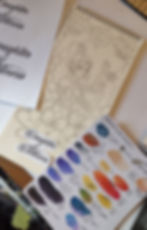
Then after having a rough idea of what the color palette will be based of the iPad's sketch, I take my watercolors and try some mixes onto paper, so I have all my "swatches" ready and don't have to think about it while working on the art. The numbers are just a reference to the paint tube number, I also have a swatch of every "pure" color + their respective number on the left side of my desk so I know how they end up looking. I also use the little heart to confirm my choices haha..... :D
It's a mix of french and english because my brain is broken and I most of the time, I think en franglais :)
And that's the final sketch I settled with before moving on with painting!
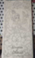
Painting!
So usually when starting a piece, I do a full underlayer of the dominant color. My "mistake" here : should have probably did the first thin layer of blue - and even paler - all over the artwork, instead of only the sky. That way, it would have make it more cohesive from the start and have less work to (re)do while building up layers to harmonize all the elements with lights and shadows. I remember my fear at the time was to mess up the warm colors and especially her skin tone. Also, washing out too much tiny details. I'll keep that in mind for my next piece!
On the first two pictures, you can clearly see that the dark blue I applied made it hard to see my frame ornament in the end. I'm also showing a piece of tracing paper with the frame design. I used that technique previously when doing the sketch, so I would have almost the same proportions on each side. It really came handy when I had to redraw these parts, it took a couple of minutes instead of hours! I did the same thing for the lettering of "Daughter of Darkness" since I used a font that I printed out and draw back on paper.
Between each layer for the background, since it was pretty dark, I could wait between minimum a hour to a day so the layer would be dry enough to paint another one on top. I also like to use coloring pencils to fill the tiny spaces that could have been missed, which is how I achieve such a packed look at the end result.
The rest of the pictures are showing your typical WIP. I love to use gel pens and use a dotwork technique for highlight and shadows. I do the first layers with watercolors and coloring pencils, then the dotwork is just the cherry on top for me! (Love using that technique when tattooing as well.)
Color packing & saturation with mixed materials
I love using bold colors. That's how I'm having the most fun at painting, is being crazy with my colors, even if my subjects can be more on the emotional side, that's how I tone it down I guess haha. For this one, I just had a blast to have a very contrasted look with the oranges and the cool tones, placed carefully so the eye would pay attention to the right elements. Also have some "restrective" aspects to consider, so I can transpose the design easily without altering it too much onto other future products.
Here's the completed piece!

The picture down below was the one I used to make the prints. It requires the less light glare possible, so it's a bit darker than what it looks in real life, because I had to do some editing tricks with the colors and lighting mostly to make it as "flat" as possible. That's why having an original is so precious and provides a different experience :)

This picture down below was taken in my backyard at around 2-3pm with a good amount of sunlight. You can see a bit of glare on the left, especially the metallic details, and more darkness at the right. Looks good on picture, but I was not able to use it for the prints!

The print ended up being a 8,5 x 17 inches, so a bit bigger than the original. I wish I could have make it a 1:1, but I feel like if the printing supplier I order from proposed this size, it would be easier for customers to find frames for this format. In the future I might make some smaller versions :)

Transfering the original to a tattoo flash design

When I create tattoo flashes, I like to make them first on paper, because I feel like my drawing talent is wayyyyy better on paper. When I was young, we didn't have graphic tablets (lol yikes I'm not that old I swear) so my pleasure associated with art is a lot higher when I can physically touch the materials and get my hands dirty basically. I realized that after my years as a game dev artist, in front of a computer all day long. I don't despise it, but I like having a little bit of chaos in my work and seeing the "mistakes" and "human" parts of it... is what makes my art, my art.
WELL! Long story short, I use my iPad as a complementary tool. In the case of doing tattoo flashes, it is to trace my hand-made sketch back to a clean version, to make it super easy to just print the stencil and tattoo away. Process is pretty simple: I take a picture of my sketch and/or final version, put it on Procreate, then trace my design.
The look I'm aiming for this tattoo flash could be similar to the final sketch before colors, with of course shading and highlights. I thought about adding the script as well, "Daughter of Darkness", but I think it would be up to the person who ends up having it on their skin. I think I'd change the text placement on the skin a bit as well if possible. I just know that this design, with the night orchids wrapping around an arm or a calve would look so good!!!
With the design now transferred digitally, using the image edited for the print version or the digital art version, I can utilize these for future products ideas like keychains, mugs, clothing, etc. Haven't been thinking the extend of those kind of products, but I'm just giving ideas there.
Setting up the vibe for pictures of the final products
I had a particular vibe in mind when taking the pictures for my online shop : I wanted people to feel like they were seeing these artworks on a table at an inn in a fantasy video game, haha! It's always a bit dark and with a warm light, obviously because of the lack of electricity, but in my eyes this type of setting is quite comforting and fits the Baldur's Gate aesthetic perfectly.


